
<img class="wf-img" src="photo.jpg" alt="Description">Pure-CSS utilities for <img> and container elements. Covers object-fit and object-position, aspect-ratio frames, size presets, border shapes, decorative effects, hover animations, SVG masks, background helpers, figure captions, flex and grid layouts, and a responsive video wrapper. No JavaScript is required.
Add wf-img to any <img> to make it display: block with max-width: 100% and height: auto . All other utility classes are composed on top of this base.
<img class="wf-img" src="photo.jpg" alt="Description">Wrap an <img> in a div.wf-img-frame to create an overflow: hidden container needed for both hover effects and aspect-ratio cropping. Apply one of the eight aspect-ratio classes to the frame to lock its proportions — the inner image autofills it with object-fit: cover; object-position: center .








<!-- Frame + aspect ratio. Inner img fills with object-fit: cover. -->
<div class="wf-img-frame wf-img-square"><img src="photo.jpg" alt="..."></div>   <!-- 1:1 -->
<div class="wf-img-frame wf-img-video"><img src="photo.jpg" alt="..."></div>    <!-- 16:9 -->
<div class="wf-img-frame wf-img-classic"><img src="photo.jpg" alt="..."></div>  <!-- 4:3 -->
<div class="wf-img-frame wf-img-photo"><img src="photo.jpg" alt="..."></div>    <!-- 3:2 -->
<div class="wf-img-frame wf-img-wide"><img src="photo.jpg" alt="..."></div>     <!-- 21:9 -->
<div class="wf-img-frame wf-img-portrait"><img src="photo.jpg" alt="..."></div> <!-- 2:3 -->
<div class="wf-img-frame wf-img-tall"><img src="photo.jpg" alt="..."></div>     <!-- 3:4 -->
<div class="wf-img-frame wf-img-taller"><img src="photo.jpg" alt="..."></div> <!-- 4:5 -->Apply object-fit utilities directly to <img> to control how the image fills its box. Pair with an object-position utility to change the focal point when cropping. These classes work best when the image has explicit width and height — for example, inside a wf-img-frame with an aspect-ratio class.

<!-- Object-fit utilities applied to <img> inside a frame -->
<div class="wf-img-frame wf-img-video">
  <img class="wf-img-fit-cover" src="photo.jpg" alt="...">   <!-- crop to fill -->
</div>

<!-- All object-fit values -->
<img class="wf-img-fit-cover">    <!-- object-fit: cover -->
<img class="wf-img-fit-contain">  <!-- object-fit: contain -->
<img class="wf-img-fit-fill">     <!-- object-fit: fill -->
<img class="wf-img-fit-scale">    <!-- object-fit: scale-down -->
<img class="wf-img-fit-none"> <!-- object-fit: none --><!-- Object-position utilities (combine with a fit class) -->
<img class="wf-img-fit-cover wf-img-pos-top"> <!-- anchor to top -->
<img class="wf-img-fit-cover wf-img-pos-bottom"> <!-- anchor to bottom -->
<img class="wf-img-fit-cover wf-img-pos-left"> <!-- anchor to left -->
<img class="wf-img-fit-cover wf-img-pos-right"> <!-- anchor to right -->
<img class="wf-img-fit-cover wf-img-pos-center"> <!-- center (default) -->Fixed-width presets applied directly to <img> . On viewports narrower than 40em , wf-img-2xl collapses to width: 100% automatically.


<img class="wf-img wf-img-xs" src="photo.jpg" alt="...">   <!-- 3rem -->
<img class="wf-img wf-img-sm" src="photo.jpg" alt="...">   <!-- 6rem -->
<img class="wf-img wf-img-md" src="photo.jpg" alt="...">   <!-- 10rem -->
<img class="wf-img wf-img-lg" src="photo.jpg" alt="...">   <!-- 16rem -->
<img class="wf-img wf-img-xl" src="photo.jpg" alt="...">   <!-- 24rem -->
<img class="wf-img wf-img-2xl" src="photo.jpg" alt="...">  <!-- 36rem (100% on mobile) -->
<img class="wf-img wf-img-full" src="photo.jpg" alt="..."> <!-- 100% -->Apply border-radius utilities to <img> or .wf-img-frame to round the corners, make a circle, or create a pill shape.
 wf-img-rounded
wf-img-circle
wf-img-rounded
wf-img-circle
 wf-img-pill
<img class="wf-img wf-img-rounded" src="photo.jpg" alt="..."> <!-- framework radius -->
<img class="wf-img wf-img-circle" src="photo.jpg" alt="...">  <!-- border-radius: 100% -->
<img class="wf-img wf-img-pill" src="photo.jpg" alt="...">    <!-- border-radius: 9999px -->

<!-- Also works on the frame wrapper -->
<div class="wf-img-frame wf-img-square wf-img-rounded">
  <img src="photo.jpg" alt="...">
</div>Add borders, shadows, and a thumbnail frame to images. These classes apply to <img> or .wf-img-frame .
 wf-img-bordered
wf-img-shadow
wf-img-elevated
wf-img-thumbnail
wf-img-bordered
wf-img-shadow
wf-img-elevated
wf-img-thumbnail
<img class="wf-img wf-img-rounded wf-img-bordered" src="photo.jpg" alt="...">  <!-- 1px border -->
<img class="wf-img wf-img-rounded wf-img-shadow" src="photo.jpg" alt="...">    <!-- subtle shadow -->
<img class="wf-img wf-img-rounded wf-img-elevated" src="photo.jpg" alt="...">  <!-- larger shadow -->
<img class="wf-img wf-img-thumbnail" src="photo.jpg" alt="..."> <!-- padded bordered card -->All hover effects require wf-img-frame as the outer wrapper. The effect class goes on the frame; the <img> is the child. Hover any card below to preview.






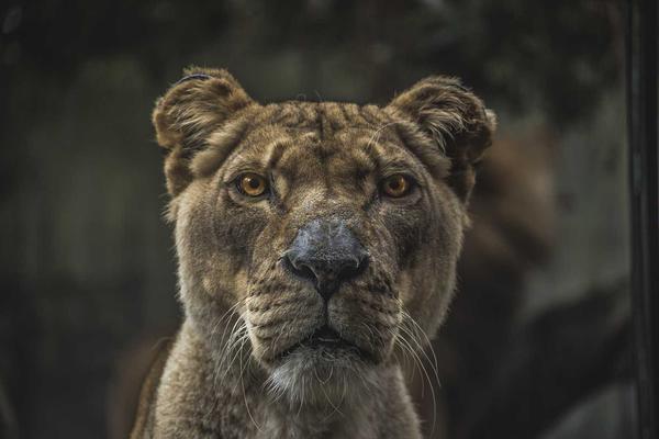
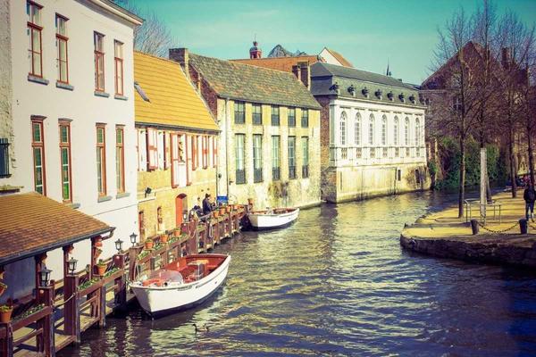
<!-- Hover class on the frame, img is the child -->
<div class="wf-img-frame wf-img-photo wf-img-hover-zoom">
  <img src="photo.jpg" alt="...">
</div><!-- All hover-effect classes -->
<div class="wf-img-frame wf-img-hover-zoom">...</div> <!-- scale img on hover -->
<div class="wf-img-frame wf-img-hover-lift">...</div> <!-- lift frame + deepen shadow -->
<div class="wf-img-frame wf-img-hover-float">...</div> <!-- lift frame + scale img -->
<div class="wf-img-frame wf-img-hover-dim">...</div> <!-- darken img on hover -->
<div class="wf-img-frame wf-img-hover-brighten">...</div> <!-- saturate + brighten on hover -->
<div class="wf-img-frame wf-img-hover-colorize">...</div> <!-- grayscale to color on hover -->
<div class="wf-img-frame wf-img-hover-grayscale">...</div> <!-- color to grayscale on hover -->
<div class="wf-img-frame wf-img-hover-blur">...</div> <!-- blur + zoom on hover -->
<div class="wf-img-frame wf-img-hover-overlay">...</div> <!-- color overlay on hover -->
<!-- Optional overlay tint modifiers (add to the frame alongside hover-overlay) -->
<div class="wf-img-frame wf-img-hover-overlay wf-img-overlay-dark">...</div>
<div class="wf-img-frame wf-img-hover-overlay wf-img-overlay-light">...</div>Reveal effects show a hidden content panel on hover. Each variant requires wf-img-frame as the outer wrapper with the reveal class, an <img> child, and a content wrapper element inside. Hover any card below to preview.
Bottom slide-up
View Project
Explore →
Glass Panel
Frosted glass slide-up
Split Reveal
<!-- Reveal class on the frame; img + content wrapper inside -->
<div class="wf-img-frame wf-img-photo wf-img-reveal-bottom">
    <img src="photo.jpg" alt="...">
    <div class="wf-img-reveal-bottom-content">
        <p>Title</p>
        <p>Subtitle</p>
    </div>
</div><!-- Bottom slide-up: gradient panel rises from bottom, img zooms -->
<div class="wf-img-frame wf-img-reveal-bottom">
<img src="photo.jpg" alt="...">
<div class="wf-img-reveal-bottom-content">...</div>
</div>
<!-- Center fade: dark overlay + content fades in and rises -->
<div class="wf-img-frame wf-img-reveal-center">
<img src="photo.jpg" alt="...">
<div class="wf-img-reveal-center-content">...</div>
</div>
<!-- Glass panel: img zooms, frosted glass card slides up from bottom -->
<div class="wf-img-frame wf-img-reveal-glass">
<img src="photo.jpg" alt="...">
<div class="wf-img-reveal-glass-content">...</div>
</div>
<!-- Split reveal: two dark panels close in from top and bottom -->
<div class="wf-img-frame wf-img-reveal-split">
<img src="photo.jpg" alt="...">
<div class="wf-img-reveal-split-content">...</div>
</div>Apply wf-img-mask plus a shape variant to clip an image into an organic or geometric silhouette using CSS mask-image . The base class sets mask-repeat: no-repeat , mask-position: center , and mask-size: cover . Use a square image for best results. wf-mask-layered is applied to a wrapper element and adds a gradient ring behind the image via ::before .
 wf-mask-blob
wf-mask-squircle
wf-mask-blob
wf-mask-squircle
 wf-mask-wave-bottom
wf-mask-arch
wf-mask-wave-bottom
wf-mask-arch
 wf-mask-diagonal
 wf-mask-ink
 wf-mask-petal
 wf-mask-clover
 wf-mask-flower
 wf-mask-ticket
<!-- Base + shape on <img> -->
<img class="wf-img wf-img-mask wf-mask-blob" src="photo.jpg" alt="...">
<img class="wf-img wf-img-mask wf-mask-squircle" src="photo.jpg" alt="...">
<img class="wf-img wf-img-mask wf-mask-wave-bottom" src="photo.jpg" alt="...">
<img class="wf-img wf-img-mask wf-mask-arch" src="photo.jpg" alt="...">
<img class="wf-img wf-img-mask wf-mask-diagonal" src="photo.jpg" alt="...">
<img class="wf-img wf-img-mask wf-mask-ink" src="photo.jpg" alt="...">
<img class="wf-img wf-img-mask wf-mask-petal" src="photo.jpg" alt="...">
<img class="wf-img wf-img-mask wf-mask-clover" src="photo.jpg" alt="...">
<img class="wf-img wf-img-mask wf-mask-flower" src="photo.jpg" alt="...">
<img class="wf-img wf-img-mask wf-mask-ticket" src="photo.jpg" alt="...">

<!-- wf-mask-layered goes on a wrapper element (adds a gradient ring via ::before) -->
<div class="wf-mask-layered">
  <img class="wf-img wf-img-circle" src="photo.jpg" alt="...">
</div>Utilities for elements that use a CSS background-image rather than an <img> tag. Set the image via the --img-bg CSS variable on wf-img-bg , then compose size, position, and repeat helpers as needed. wf-img-bg-greyscale desaturates the background using background-blend-mode: luminosity .
<!-- Set background-image via CSS variable -->
<div class="wf-img-bg wf-img-bg-size-cover wf-img-bg-pos-center"
     style="--img-bg: url(hero.jpg); height: 400px;">
  ...
</div>

<!-- Background size -->
<div class="wf-img-bg-size-cover">...</div>    <!-- background-size: cover -->
<div class="wf-img-bg-size-contain">...</div>  <!-- background-size: contain -->
<div class="wf-img-bg-size-auto">...</div>     <!-- background-size: auto -->

<!-- Background position -->
<div class="wf-img-bg-pos-center">...</div>  <!-- center center -->
<div class="wf-img-bg-pos-bottom">...</div>  <!-- bottom -->
<div class="wf-img-bg-pos-left">...</div>    <!-- left -->
<div class="wf-img-bg-pos-right">...</div>   <!-- right -->
<div class="wf-img-bg-pos-tc">...</div>      <!-- top center -->
<div class="wf-img-bg-pos-bc">...</div>      <!-- bottom center -->

<!-- Background repeat -->
<div class="wf-img-bg-repeat-none">...</div> <!-- no-repeat -->
<div class="wf-img-bg-repeat">...</div>      <!-- repeat -->

<!-- Greyscale overlay via blend mode -->
<div class="wf-img-bg wf-img-bg-size-cover wf-img-bg-greyscale"
style="--img-bg: url(photo.jpg)">...</div>wf-figure resets browser margin on <figure> and makes it a block container. Pair it with wf-figure-caption on a <figcaption> for styled muted caption text. Add wf-figure-caption-center to center-align the caption.


<figure class="wf-figure">
  <img class="wf-img wf-img-rounded" src="photo.jpg" alt="Description">
  <figcaption class="wf-figure-caption">Caption text</figcaption>
</figure>

<!-- Centered caption -->
<figure class="wf-figure">
  <div class="wf-img-frame wf-img-photo wf-img-rounded">
    <img src="photo.jpg" alt="...">
  </div>
  <figcaption class="wf-figure-caption wf-figure-caption-center">Caption text</figcaption>
</figure>wf-img-group is a flex-wrap layout where each child frame grows to fill available space with a minimum of 12rem . wf-img-grid is an autofill CSS grid with the same 12rem minimum column width — useful for masonry-style image galleries.
<div class="wf-img-group">
  <div class="wf-img-frame wf-img-photo wf-img-rounded">
    <img src="photo1.jpg" alt="...">
  </div>
  <div class="wf-img-frame wf-img-photo wf-img-rounded">
    <img src="photo2.jpg" alt="...">
  </div>
  <div class="wf-img-frame wf-img-photo wf-img-rounded">
    <img src="photo3.jpg" alt="...">
  </div>
</div><div class="wf-img-grid">
<div class="wf-img-frame wf-img-square wf-img-rounded">
<img src="photo1.jpg" alt="...">
</div>
<div class="wf-img-frame wf-img-square wf-img-rounded">
<img src="photo2.jpg" alt="...">
</div>
<!-- ... -->
</div>wf-video-frame is a block wrapper that constrains an <iframe> or <video> to a 16:9 aspect ratio at full width, with border: 0 and the framework border-radius applied. An optional <figcaption> inside the wrapper renders as a centered muted caption beneath the video.
Optional caption below the video frame
<!-- YouTube / Vimeo iframe -->
<div class="wf-video-frame">
  <iframe src="https://www.youtube.com/embed/VIDEO_ID"
          title="Video title" allowfullscreen loading="lazy"></iframe>
  <figcaption>Optional caption</figcaption>
</div>

<!-- Native video -->
<div class="wf-video-frame">
  <video controls>
    <source src="video.mp4" type="video/mp4">
  </video>
</div>All modifier classes available on .wf-img
| Class | Description |
|---|---|
wf-img |
display: block; max-width: 100%; height: auto — base class for all <img> elements.
|
wf-img-frame |
inline-block; position: relative; overflow: hidden — container required for aspect-ratio cropping and hover effects. |
wf-img-square |
Aspect ratio 1:1 on the frame. Sets display: block; width: 100%. |
wf-img-video |
Aspect ratio 16:9 on the frame. |
wf-img-classic |
Aspect ratio 4:3 on the frame. |
wf-img-photo |
Aspect ratio 3:2 on the frame. |
wf-img-wide |
Aspect ratio 21:9 on the frame. |
wf-img-portrait |
Aspect ratio 2:3 on the frame. |
wf-img-tall |
Aspect ratio 3:4 on the frame. |
wf-img-taller |
Aspect ratio 4:5 on the frame. |
wf-img-fit-cover … wf-img-fit-none |
Object-fit utilities on <img>: cover, contain, fill, scale-down, none.
|
wf-img-pos-top … wf-img-pos-center |
Object-position utilities: top, bottom, left, right, center.
|
wf-img-xs … wf-img-2xl |
Fixed-width presets: 3rem, 6rem, 10rem, 16rem, 24rem, 36rem. wf-img-2xl collapses to 100% below 40em. |
wf-img-full |
width: 100%. |
wf-img-rounded |
Applies --_img-radius (default var(--wf-radius-6)) to the element.
|
wf-img-circle |
border-radius: 100%. |
wf-img-pill |
border-radius: 9999px. |
wf-img-bordered |
Adds a 1px solid border using --_img-border-color. |
wf-img-shadow |
Subtle drop shadow (--_img-shadow-sm). |
wf-img-elevated |
Larger drop shadow (--_img-shadow-lg). |
wf-img-thumbnail |
White padded card frame: border + background + rounded corners + subtle shadow. |
wf-img-hover-zoom |
Scales the inner image on hover. Requires wf-img-frame. |
wf-img-hover-lift |
Lifts the frame with translateY and deepens shadow on hover. |
wf-img-hover-float |
Lifts the frame and simultaneously scales the image on hover. |
wf-img-hover-dim |
Darkens the image with brightness() filter on hover. |
wf-img-hover-brighten |
Starts slightly desaturated; brightens and saturates on hover. |
wf-img-hover-colorize |
Starts grayscale; reveals color on hover. |
wf-img-hover-grayscale |
Starts in color; desaturates on hover. |
wf-img-hover-blur |
Blurs and zooms the image on hover. |
wf-img-hover-overlay |
Fades in a color overlay (--_img-overlay-bg) on hover. Uses ::after pseudo-element — requires wf-img-frame. |
wf-img-overlay-dark |
Modifier for wf-img-hover-overlay: sets overlay to dark semi-transparent. |
wf-img-overlay-light |
Modifier for wf-img-hover-overlay: sets overlay to light semi-transparent. |
wf-img-reveal-bottom |
On hover: inner image zooms; a gradient panel slides up from the bottom revealing wf-img-reveal-bottom-content. |
wf-img-reveal-center |
On hover: a dark overlay fades in via ::after and wf-img-reveal-center-content fades + rises to center. |
wf-img-reveal-glass |
On hover: inner image zooms; a frosted-glass card (wf-img-reveal-glass-content) slides up from the bottom. |
wf-img-reveal-split |
On hover: two dark panels close in from the top and bottom revealing wf-img-reveal-split-content in the center. |
wf-img-mask |
Base class for SVG masks. Sets mask-repeat, mask-position, and mask-size. Always pair with a shape variant below.
|
wf-mask-blob … wf-mask-ticket |
SVG mask shapes: blob, squircle, wave-bottom, arch, diagonal, ink, petal, clover, flower, ticket.
|
wf-mask-layered |
Applied to a wrapper element. Adds a gradient organic-shape ring behind the element via ::before.
|
wf-img-bg |
Reads background-image from the --img-bg CSS variable. |
wf-img-bg-size-* |
Background size: cover, contain, auto. |
wf-img-bg-pos-* |
Background position: center, bottom, left, right, tc (top center), bc (bottom center).
|
wf-img-bg-repeat / wf-img-bg-repeat-none |
Background repeat: repeat or no-repeat. |
wf-img-bg-greyscale |
Desaturates a background image using background-blend-mode: luminosity with a gray color overlay. |
wf-figure |
display: block; margin: 0 — resets <figure> browser defaults.
|
wf-figure-caption |
Styled muted caption: 0.875rem font size, 1.45 line-height, muted color. |
wf-figure-caption-center |
Modifier that center-aligns the caption text. |
wf-img-group |
Flex-wrap row where each child frame grows to fill available space with a minimum width of 12rem.
|
wf-img-grid |
CSS grid with repeat(auto-fill, minmax(12rem, 1fr)) and a 1rem gap.
|
wf-video-frame |
Block wrapper that forces an inner <iframe> or <video> to 16:9 aspect ratio at full width with the framework border-radius. |